前回を持って一通りのパックマンゲームの完成としていましたが、やり残したことがいくつかあったので、そのタスクを消化していきたいと思います。
まず今回は、キャラクターのそれぞれのオブジェクト構造をもっとシンプルにしたいと思います。
敵キャラは、svgを使ってなかなか複雑な構造になっていたのを、シンプル構造に変更して、自キャラは半円2つの疑似要素構造だったのを擬似要素1つでできるようにして、cssを軽減化させました。
これまでの構造については、以下の記事を参考にして、今回構造と比べてみてください。
[css] パックマンのキャラアニメーション#1 キャラクター作成
[css + svg] パックマンのキャラアニメーション#2 敵キャラ作成
https://blog.myntinc.com/2023/04/css-svg-3.html
検証用HTML
ゲーム画面だとキャラクタが動いて確認しずらいので、次のHTMLを使って確認することにします。
character.html
<!DOCTYPE html>
<html>
  <head>
    <meta charset='utf-8' />
    <meta content="width=device-width,initial-scale=1.0,minimum-scale=1.0" name="viewport">
    <link rel='stylesheet' href='css/pacman.css' />
    <link rel='stylesheet' href='css/ghost.css' />
    <style>
    :root{
      --block:16px;
      --size-chara:calc(var(--block) * 2);
      --anim-speed:1s;
    }
    body{
      background-color:black;
      width:100%;
      overflow:hidden;
    }

    .frame-area,
    .frame-area p,
    .frame-area p::before,
    .frame-area p::after{
      font-size:0;
      -webkit-box-sizing : border-box;
        -moz-box-sizing : border-box;
          -o-box-sizing : border-box;
          -ms-box-sizing : border-box;
              box-sizing : border-box;
    }

    .frame-area{
      position:relative;
      transform:scale(2.0);
      transform-origin:top left;
    }
    .frame-area > *{
      position:absolute;
    }

    #pacman{
      top:10px;
      left:10px;
    }
    #ghost_1{
      top:50px;
      left:10px;
    }

    #ghost_2{
      top:90px;
      left:10px;
    }
    #ghost_3{
      top:130px;
      left:10px;
    }
    #ghost_4{
      top:170px;
      left:10px;
    }
    #ghost_5{
      top:210px;
      left:10px;
    }
    #ghost_6{
      top:250px;
      left:10px;
    }

    </style>
</head>
<body>

<div class='frame-area'>
  <div id='pacman' class='pacman' data-status="anim" data-direction="top"></div>

  <div id='ghost_1' class='ghost' data-color="1" data-direction="left">
    <div class='eye-l'></div>
    <div class='eye-r'></div>
    <div class='mouse'></div>
  </div>

  <div id='ghost_2' class='ghost' data-color="2" data-direction="right">
    <div class='eye-l'></div>
    <div class='eye-r'></div>
    <div class='mouse'></div>
  </div>
  <div id='ghost_3' class='ghost' data-color="3" data-direction="up">
    <div class='eye-l'></div>
    <div class='eye-r'></div>
    <div class='mouse'></div>
  </div>
  <div id='ghost_4' class='ghost' data-color="4" data-direction="down">
    <div class='eye-l'></div>
    <div class='eye-r'></div>
    <div class='mouse'></div>
  </div>
  <div id='ghost_5' class='ghost' data-color="1" data-direction="left" data-status="weak">
    <div class='eye-l'></div>
    <div class='eye-r'></div>
    <div class='mouse'></div>
  </div>
  <div id='ghost_6' class='ghost' data-color="1" data-direction="left" data-status="dead">
    <div class='eye-l'></div>
    <div class='eye-r'></div>
    <div class='mouse'></div>
  </div>
</div>

<script>
const elm = document.querySelector('.pacman')
elm.addEventListener('click' , ((e)=>{
  switch(e.currentTarget.getAttribute('data-status')){
    case 'dead':
      e.currentTarget.setAttribute('data-status' , 'anim')
      break

    default:
      e.currentTarget.setAttribute('data-status' , 'dead')
      break
  }
}))
</script>

</body>
</html>
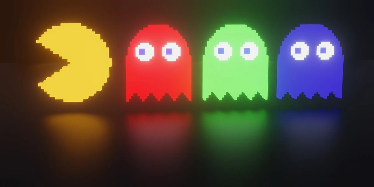
自キャラ
前回のプログラムよりもかなりシンプルになっている事を確認してもらえると、いいかもです。
半円2つが、1つの要素だけでピザカットの形を作ってアニメーションさせているのですが、
ポイントは、clip-path機能を使って要素をくり抜いているという構造です。
deadモーションを作った時に、思いついて試してみたところ上手くできました。
css/pacman.css
.pacman{
  position : absolute;
  z-index  : 10;
  display  : inline-block;
  width    : var(--size-chara);
  height   : var(--size-chara);
}
.pacman::before{
  content:'';
  background-color : yellow;
  display : block;
  width   : 100%;
  height  : 100%;
  border-radius : 50%;
}

/* パクパク処理 */
.pacman[data-status="anim"]::before{
  animation-name : pacman_anim;
  animation-duration:var(--anim-speed);
  animation-timing-function: ease-in-out;
  animation-iteration-count: infinite;
}
@keyframes pacman_anim{
  0%{
    clip-path: polygon(
       50%  60%,
       50%   0%,
      100%   0%,
      100% 100%,
        0% 100%,
        0%   0%,
       50%   0%,
       50%  60%
    );
  }
  50%{
    clip-path: polygon(
       50%  60%,
      100%   0%,
      100%   0%,
      100% 100%,
        0% 100%,
        0%   0%,
        0%   0%,
       50%  60%
    );
  }
  100%{
    clip-path: polygon(
       50%  60%,
       50%   0%,
      100%   0%,
      100% 100%,
        0% 100%,
        0%   0%,
       50%   0%,
       50%  60%
    );
  }
}

/* ステージ座標とのズレ解消用処理 */
.pacman{
  transform : translate(calc(var(--block) / -2) , calc(var(--block) / -2));
}

.pacman::before,
.pacman[data-direction="left"]::before{
  transform: rotate(-90deg);
}
.pacman[data-direction="right"]::before{
  transform:rotate(90deg);
}
.pacman[data-direction="up"]::before{
  transform: rotate(0deg);
}
.pacman[data-direction="down"]::before{
  transform: scaleY(-1);
}


/* 動き停止 */
.frame-area[data-status='clear'] .pacman,
.pacman[data-status='crashed']{
  animation-play-state: paused;
}

/* Dead処理 */
.pacman[data-status="dead"]::before{
  animation-name : pacman-dead;
  transform:rotate(0deg);
  animation-delay : 0.0s;
  animation-direction : normal;
  animation-duration : 2.0s;
  animation-fill-mode: forwards;
  animation-iteration-count: 1;
  animation-timing-function: linear;
}
@keyframes pacman-dead{
  0%{
    clip-path: polygon(
       50%  50%,
       50%   0%,
      100%   0%,
      100% 100%,
        0% 100%,
        0%   0%,
       50%   0%,
       50%  50%
    );
  }
  25%{
    clip-path: polygon(
       50%  50%,
      100%   0%,
      100%   0%,
      100% 100%,
        0% 100%,
        0%   0%,
        0%   0%,
       50%  50%
    );
  }
  75%{
    clip-path: polygon(
       50%  50%,
      100% 100%,
      100% 100%,
      100% 100%,
        0% 100%,
        0% 100%,
        0% 100%,
       50%  50%
    );
  }

  100%{
    clip-path: polygon(
       50%  50%,
       50% 100%,
       50% 100%,
       50% 100%,
       50% 100%,
       50% 100%,
       50% 100%,
       50%  50%
    );
  }
}
敵キャラ
svgを使っていたところを、自キャラと基本的には同じ方式で、疑似要素+clip-path機能を使って、輪郭を作り、
目と口はどうしても別オブジェクトにしてゲーム内でコントロールする必要があったので、html内に内包しました。
サンプルHTMLのcharacter.htmlに書かれている、class="ghost"の箇所がかなりシンプルになっている事を確認してください。
css/ghost.css
.ghost{
  position : absolute;
  z-index  : 10;
  display  : inline-block;
  width    : 32px;
  height   : 32px;
  transform:translate(calc(var(--block) / -2) , calc(var(--block) / -2));
}
.ghost::before{
  content:'';
  position:absolute;

  display : block;
  width   : 100%;
  height  : 100%;
  clip-path : path('M 0,24 Q 0,0 16,0 Q 32,0 32,24 L 32,30  Q 30,34 26,30 Q 23,26 19,30 Q 16,34 12,30 Q 10,26 6,30 Q 2,34 0,30 T 0,30 z');
}

.ghost[data-color='1']::before{
  background-color : red;
}
.ghost[data-color='2']::before{
  background-color : orange;
}
.ghost[data-color='3']::before{
  background-color : lightblue;
}
.ghost[data-color='4']::before{
  background-color : pink;
}
.ghost[data-status='weak']::before{
  background-color : blue;
}

.ghost .eye-l,
.ghost .eye-r{
  position:absolute;
  top:8px;
  width:8px;
  background-color:white;
  width:9px;
  height:9px;
  border-radius:50%;
}
.ghost .eye-l{
  left:5px;
}
.ghost .eye-r{
  right:5px;
}
.ghost .eye-l::before,
.ghost .eye-r::before{
  content:'';
  position:absolute;
  left:50%;
  top:50%;
  width:50%;
  height:50%;
  background-color:black;
  transform:translate(-50%,-50%);
  border-radius:50%;
}
.ghost[data-direction='left'] .eye-l{
  left:0px;
}
.ghost[data-direction='left'] .eye-r{
  right:10px;
}
.ghost[data-direction='right'] .eye-l{
  left:10px;
}
.ghost[data-direction='right'] .eye-r{
  right:0px;
}
.ghost[data-direction='up'] .eye-l,
.ghost[data-direction='up'] .eye-r{
  top:2px;
}
.ghost[data-direction='down'] .eye-l,
.ghost[data-direction='down'] .eye-r{
  top:16px;
}

.ghost[data-direction='left'] .eye-l::before,
.ghost[data-direction='left'] .eye-r::before{
  left:0;
  right:auto;
  transform:translate(0,-50%);
}
.ghost[data-direction='right'] .eye-l::before,
.ghost[data-direction='right'] .eye-r::before{
  left:auto;
  right:0;
  transform:translate(0,-50%);
}
.ghost[data-direction='up'] .eye-l::before,
.ghost[data-direction='up'] .eye-r::before{
  top:0;
  bottom:auto;
  transform:translate(-50%,0);
}
.ghost[data-direction='down'] .eye-l::before,
.ghost[data-direction='down'] .eye-r::before{
  top:auto;
  bottom:0;
  transform:translate(-50%,0);
}

.ghost[data-status='weak'] .eye-l{
  top:8px;
  left:8px;
}
.ghost[data-status='weak'] .eye-r{
  top:8px;
  right:8px;
}
.ghost[data-status='weak'] .eye-l,
.ghost[data-status='weak'] .eye-r{
  width:6px;
  height:6px
}
.ghost[data-status='weak'] .eye-l::before,
.ghost[data-status='weak'] .eye-r::before{
  opacity:0;
}
.ghost[data-status='weak'] .mouse{
  position:absolute;
  top:16px;
  left:0;
  width:100%;
  height:8px;
  background-color:#FFF;
  clip-path : path('M 2,6 Q 4,2 6,4 Q 8,8 10,4 Q 12,2 14,4 Q 16,8 18,4 Q 20,2 22,4 Q 24,8 26,4 Q 28,2 30,6  L 30,7  Q 28,3 26,5 Q 24,9 22,5 Q 20,3 18,5 Q 16,9 14,5 Q 12,3 10,5 Q 8,9 6,5 Q 4,3 2,7');
}

.ghost[data-status='dead']::before{
  background-color : transparent;
}
デモ
ポイント解説
cssのclip-pathはsvgの記述でできる
今回、ほとんどの改善箇所で使っているCSSのclip-pathという機能ですが、
これは、要素を部分的にくり抜く機能で、非常に便利に使えます。
参考 :
https://developer.mozilla.org/en-US/docs/Web/CSS/clip-path
この機能を使うと、これまで苦手とされていたcssを使ったアイコン表現が、かなりシンプルなHTML構造で且つ、安定した見え方で記述することができます。
ただ、いくつか注意点があり、clip-path : polygon("...");の記述は、内容に%が使えて、要素の拡大縮小に対応できますが、曲線などが入る場合に、clip-path : path("...");を使ってsvgのpathタグのd属性の値をそのまま貼り付けられるようにできますが、この場合は、値に%表記ができません。
要素のサイズが一定になる場合は問題ないですが、サイズ変更がある場合は、transform:scale(...);を使ってコントロールする必要がありますね。
要素のつなぎ合わせの切れ目
今回のcss組み直しは、実は出来上がったゲームをスマホ対応しようとした時に、画面サイズを変更したら、キャラクターのパーツの継ぎ目に隙間ができていた事が原因でした。
キャラクタの構造がシンプルになるほど、こうした不具合とは縁がなくなるので、構造体には気をつけて作りたいですね。
svg pathの作り方
今回の作業でもっとも時間がかかったのは、質のいいsvg pathを作りたいけど、svgファイルを書き換えながらブラウザで確認するのが非常に面倒くさい作業だったので、エディタを探してみたら、ブラウザで動く便利サイトがありました。
Online SVG code editor
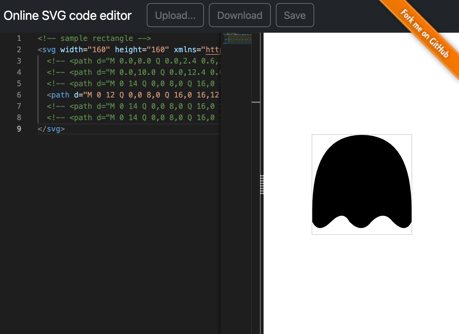
試行錯誤したコードがこちらです。(貼り付けて確認してみてください)
<!-- sample rectangle -->
<svg width="160" height="160" xmlns="http://www.w3.org/2000/svg" viewBox="0 0 16 16">
  <!-- <path d="M 0.0,0.0 Q 0.0,2.4 0.6,3.2 T 3.0,2.4 7.2,2.4 10.4,2.4 12.8,2.4 16.0,2.4 L 16.0,0.0 z" /> -->
  <!-- <path d="M 0.0,10.0 Q 0.0,12.4 0.6,13.2 T 3.0,12.4 7.2,12.4 10.4,12.4 12.8,12.4 16.0,12.4 L 16.0,10.0 z" /> -->
  <!-- <path d="M 0 14 Q 0,0 8,0 Q 16,0 16,14  Q 14,18 12,14 T 10,16 Q 8,14 Q 6,18 4,14 Q 2,18 0 14 z" /> -->
  <path d="M 0 12 Q 0,0 8,0 Q 16,0 16,12 L 16,14  Q 15,16 13,14 Q 11.5,12 9.5,14 Q 8,16 6,14 Q 5,12 3,14 Q 1,16 0,14 T 0,14 z" />
  <!-- <path d="M 0 14 Q 0,0 8,0 Q 16,0 16,14  L 15,15.5 13.5,16 12,15.5 L 11,14 10,15.5 8,16 6.5,15.5 L 5,14 4,15.5 2.5,16 1,15.5 0,14 z" /> -->
  <!-- <path d="M 0 14 Q 0,0 8,0 Q 16,0 16,14  L 15,15.5 Q 13.5,16 12,15.5 L 11,14 10,15.5 8,16 6.5,15.5 L 5,14 4,15.5 2.5,16 1,15.5 0,14 z" /> -->
</svg>
知財
パックマンは、バンダイナムコ社の登録商標です。
PAC-MAN™ & ©1980 BANDAI NAMCO Entertainment Inc.


0 件のコメント:
コメントを投稿